
My Projects
Colors are a major factor in design, influencing emotions, perceptions, and creating unique atmospheres. In interior design, color choices can define a space, evoke moods, and reflect individual preferences. The idea of aligning fixture and hardware finishes with the color of the year is a contemporary approach to design cohesion. By integrating these elements, spaces can achieve a harmonious and modern style that reflects current trends.
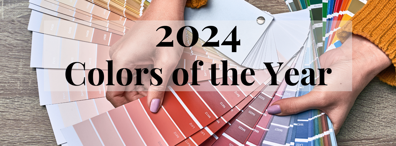
Paint companies have unveiled their 2024 Colors of the Year, each contributing a distinct hue to the design landscape. These colors are not only chosen for their visual appeal but also for the messages and feelings they convey.
Color theory is a major factor in any type of interior design, particularly when it comes to spaces like kitchens and bathrooms. In these areas, where lighting, amount of space, and intended use can significantly impact the overall atmosphere of the space. Color theory encompasses principles such as the color wheel, complementary colors, and analogous color schemes. In kitchen design, for instance, warm tones like reds and yellows can stimulate appetite and create a welcoming ambiance, while cool blues and greens in bathrooms promote a sense of calm and cleanliness. The careful selection of colors can also influence perceptions of space, with lighter hues making a room feel more expansive. Ultimately, integrating color theory into interior design for kitchens or bathrooms allows for the creation of spaces that break norms by still following traditional theories.
Timeless White Walls
White stands as a timeless choice for walls, prevalent across diverse design styles. Its popularity stems from its ability to create a sense of purity, simplicity, and openness in interior spaces. White's enduring popularity lies in its versatility. It serves as a blank canvas, allowing for easy incorporation of various decor styles while creating a clean and open ambiance.
Not all white paints carry the same hue. The subtle nuances in undertones distinguish shades of white, making each unique in its visual impact. From pure white to off-white and ivory, the spectrum of white shades provide nuanced choices to cater to specific design preferences and lighting conditions. Exploring popular white shades, such as pure white for a crisp modern look, off-white for warmth, and ivory for a classic touch, provides a spectrum of options for designers.
White walls contribute to a sense of spaciousness and maximize the reflection of natural light, creating bright and airy interiors. The neutral nature of white allows for seamless integration with different color schemes and design elements, offering flexibility in decor choices. White's enduring quality ensures that it remains a timeless backdrop, easily adaptable to evolving design trends without losing its appeal.


Behr has unveiled a captivating color of the year, reflecting their unique design vision and staying at the forefront of contemporary trends. Described by Behr as a “versatile soft black,” Cracked Pepper is a delightful cool toned grey.
Cool-toned grey walls can have a transformative impact on the perception of a space. Grey, being a neutral color, provides a versatile backdrop, while cool-toned greys, with undertones of blue or green, evoke a sense of calm and serenity. Additionally, these hues tend to recede visually, creating an illusion of expanded space.
Matching Metal Finishes to Cracked Pepper
To complement Cracked Pepper, polished chrome, black stainless steel and matte black are great choices. The soft black appearance of the paint can be paired with a reflective and cool toned polished chrome to create a contrast of light colored metal and dark moody paint. Black stainless steel pairs well with Cracked Pepper as it amplifies the dark points of the paint while still having a classic reflective metal element to the finish. As black and gray are closely related on the color scale, matte black is an obvious pairing for a grey toned paint, and will easily integrate with a modern and bold interior.
Our Faucet Recommendations to Match:


Sherwin-Williams revealed a very approachable color of the year called Upward. Upward is described by Sherwin-Williams as a “denim blue with calm gray undertones” and a “light neutral.”
Blue with grey undertones is a versatile and sophisticated choice in interior design, and this subdued combination brings together the calming qualities of blue, and the neutral yet modern essence of grey. Blue with grey undertones can evoke a sense of tranquility, making it well-suited for bedrooms, living rooms, or any space where relaxation is key. The integration of grey undertones adds depth and complexity to the blue hue, preventing it from being overly vibrant. This combination can also visually expand a room, creating a feeling of airiness.
Matching Metal Finishes to Upward
To complement Upward, polished chrome, antique brass, and brushed nickel are great choices. The cool toned paint color will mix well with cool toned metal finishes.
Our Faucet Recommendations to Match:


Glidden’s color of the year is called Limitless, and is a "fresh, warm hue, that contains both the power of a primary color and the essence of a neutral”. This muted yellow paint can be implemented in both modern and traditional interior designs, and mixed with an array of hardware finish colors.
Unlike brighter yellows, muted shades exude a sense of understated sophistication, making them ideal for various design schemes. As yellow is a primary color, it contributes to a welcoming ambiance while maintaining neutrality. Overall, a muted yellow as a primary color adds a touch of warmth and character.
Matching Metal Finishes to Limitless
To match with Limitless, choose matte black, oil rubbed bronze, or brushed nickel. These finishes are classic choices for designs that lean both modern or traditional.
Our Faucet Recommendations to Match:


Valspar’s color of the year is called Renew Blue, and is a “nourishing, green-influenced blue that creates a sense of peace.” This pastel pop of green-inspired blue is great for polished silver tones and brushed texture gold tones.
A blue-based paint color with hints of green opens up a myriad of possibilities for interior design. To style a space with this color, try incorporating natural elements like plants and wooden textures to complement the green undertones. Furniture and decor in neutral tones or whites can enhance the crispness of the blue-green hue while allowing it to take center stage. Additionally, incorporating metallic accents, such as brass or gold, can add a touch of sophistication. The key is to strike a balance between the coolness of the blue and the freshness of the green, creating a visually pleasing space of serenity.
Matching Metal Finishes to Renew Blue
Complementary metal finishes to go along with Renew Blue are brushed brass, black stainless, and polished chrome.
Our Faucet Recommendations to Match:


Minwax’s color of the year is called Bay Blue. This color is available as a wood stain rather than a paint. Minwax takes a mission driven approach to explaining their choice for Bay Blue as their 2024 color of the year. The color is inspired by the collision of natural and virtual worlds. “This relaxing mix of blue and green expands our connection to water and wellness, moving beyond the growth-focused greens of recent years…”
The use of blue, a color associated with calmness and depth, can turn a mundane piece of wood into a statement piece. The blue stain imparts a sense of character and individuality, adding a contemporary and artistic touch to the item you’re staining.
Matching Metal Finishes to Bay Blue
To bridge the natural and virtual worlds that constantly surround us, it is just as important to introduce metal elements as it is to incorporate wood, stone, and greenery into interior design. The classic polished brass, polished chrome, and matte black will be a good partner to Bay Blue.
Our Shower Drain Recommendations to Match:


The color of the year by Dutch Boy is Ironside, and they state that, “This deep, comforting green is a richly dimensional hue that soothes and reassures.”
This sophisticated color choice brings a sense of nature indoors, infusing the room with a cozy and organic feel. The deep hues can visually envelop the space, making it feel intimate and inviting. To leverage this color as an advantage, experiment by pairing it with natural materials like wood and stone to enhance the earthy theme. Additionally, incorporating warm lighting can further amplify the richness of the brown-green.
Matching Metal Finishes to Ironside
Brushed nickel, polished chrome, and brushed brass are good metal finishes to pair with the rich green Ironside color.
Our Faucet Recommendations to Match:


Graham & Brown announced Viridis as their color of the year. They describe their 2024 color as “A beautiful muted green color, the Color of the Year 2024 has been conscientiously curated to create a warm and welcoming space, offering a calming atmosphere for its guests… It is especially perfect for the entertaining and entrance areas where outside and inside meet.”
This muted green color, often associated with nature and tranquility, falls within the broader spectrum of greens that exude a sense of calmness and balance. As part of color theory, muted green aligns with analogous color schemes, harmonizing well with neighboring tones on the color wheel such as blues and yellows.
Matching Metal Finishes to Viridis
As Virdis pulls inspiration from nature's green hues, it will match with brushed nickel, oil rubbed bronze, and polished chrome finishes.
Our Faucet Recommendations to Match:


Benjamin Moore’s color of the year is Blue Nova. They describe the color as a blend of violet and blue.
When used in interior design, the violet-tinted blue can be applied strategically to evoke specific moods. In bedrooms, it may enhance a serene and restful atmosphere, while in living areas, it can add a touch of elegance and creativity. The color's perception is influenced by its undertones, and in this case, the violet tint introduces a layer of complexity and warmth. When complemented with neutral furnishings or metallic accents, this shade can be a focal point, contributing to stunning design.
Matching Metal Finishes to Blue Nova
Matching finishes to Blue Nova are polished chrome, brushed nickel, and matte black.
Our Faucet Recommendations to Match:


Skipping Stones was announced as Dunn-Edwards 2024 color of the year. It is a “serene and steely blue with hints of green and gray.” This color will pair seamlessly with any metal colors, but can be elevated with brass finishes.
The color's impact extends beyond the visual, influencing the perceived temperature and atmosphere of the room. It provides a canvas for diverse styling options, allowing for a harmonious blend of furnishings and decor that contribute to a contemporary and balanced interior setting.
Matching Metal Finishes to Skipping Stones
For Skipping Stones to shine in a space, pair it with brushed brass, polished brass, and antique brass fixtures and hardware.
Our Faucet Recommendations to Match:

3. English Country KS775ALBSAC
The significance of colors in interior design cannot be overstated, as they hold the power to shape emotions, perceptions, and the overall atmosphere of a space. The contemporary approach of aligning fixture and hardware finishes with the Color of the Year reflects a commitment to design cohesion. The unveiling of 2024 Colors of the Year by paint companies further emphasizes the importance of color choices, not just for visual appeal but for the messages and feelings they convey.
Color theory contributes largely to interior design, particularly in common areas such as kitchens and bathrooms where lighting, space constraints, and intended use are big considerations. Warm tones in kitchens stimulate appetite and create a welcoming ambiance, while cool blues and greens in bathrooms promote calmness and cleanliness. The strategic application of color theory can also influence perceptions of space, with lighter hues expanding the visual boundaries of a room. Integrating color theory into kitchen and bathroom design allows for the creation of spaces that break norms while adhering to traditional theories. As the 2024 Colors of the Year unfold, they emphasize the significance of thoughtful color choices in designing spaces that go beyond the visual aspect to evoke emotions and reflect individual preferences.
